You're Doing Call to Actions Wrong. It's Killing Conversions. Here's What To Do
Learn how to optimise your landing page call to action buttons for maximum conversions with our handy proven tips

Landing page call to actions may seem simple.
They're just buttons right? Wrong.
There are things you can do, and don't do that will make a real difference to your conversion rates.
In this post we'll be covering the do's and don'ts of landing page call to actions so you can get as many clicks as possible.
Let's dive in!
1. Make your buttons HIGH contrast

You call to actions should make my eyes bleed. Yes that's right. Dial the contrast RIGHT UP friends. It's also good for accessibility.
2. Size matters. Make your buttons big!

The bigger your button is the more clicks you're going to get.
Don't be afraid to size that landing page call to action right up!
3. Sell the destination. Not the journey.

Your button copy should be all about what I get. Not what I have to do. For example, Get my quote is a lot better then Submit a form. You wan't your CTA to tell the customer what they will get, not the action that have to take to get it.
4. Use personalisation. It works.
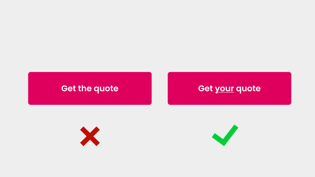
Personalisation works when it comes to the text on your landing page call to actions.
Now I don't mean peoples names! ( although that would be AWESOME ) I mean use words like 'My' and 'Yours' in your landing page call to action buttons.
They have been proven to lift conversion rates.
5. Don't have too many different CTA's
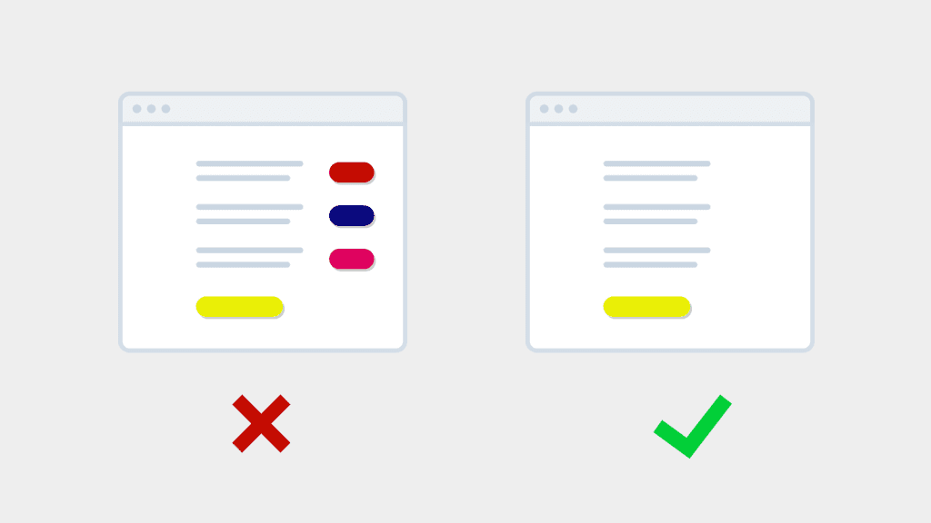
I see some landing pages and there's like 6 different call to actions on the same page!
I don't mean the same call to action.
I mean there's 6 different buttons allowing me to do 6 different things. This kills conversion rates!
Have one or two things you want your customers to do. Maximum.
6. Make the buttons a different colour to your site
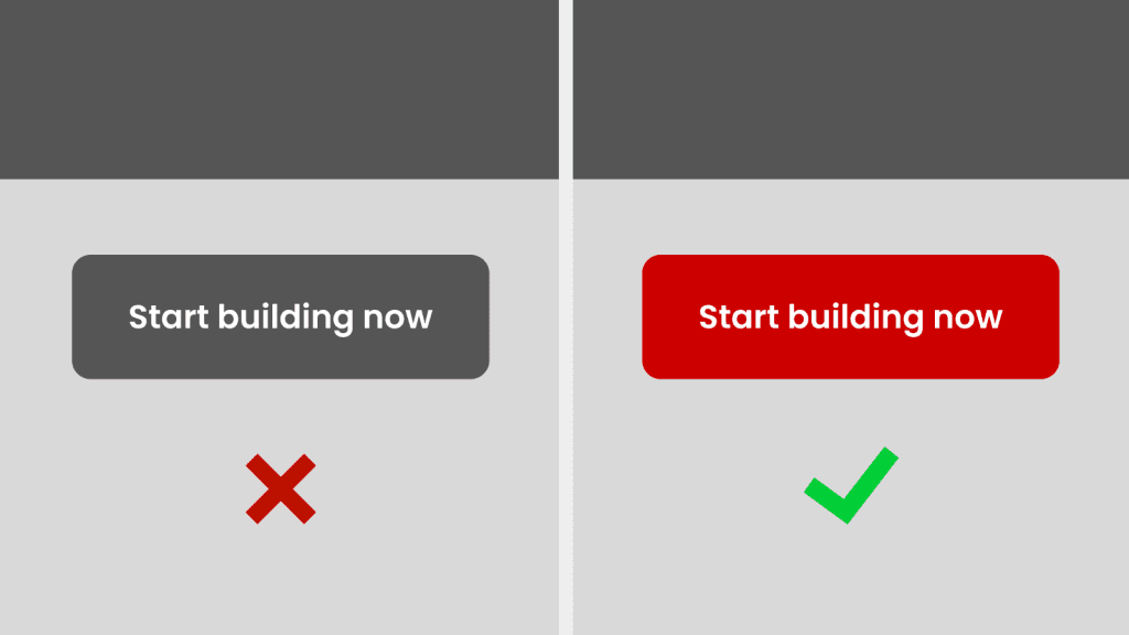
If your site is mostly blue. Don't make your buttons blue. Make them red.
You should be using contrasting colours to the rest of your site for the win!
7. Give your call to actions space

Don't crowd your CTA's with loads of things close to them.
Give your landing page call to actions space to breath! You will get more clicks.
8. Get the priority right
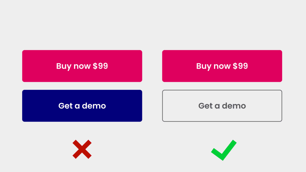
If you're got a secondary call to action on your landing page, make sure it's not overpowering the main call to action.
They need to have a priority. Your main call to action should be the boldest, most obvious button.
9. Be consistent with your buttons
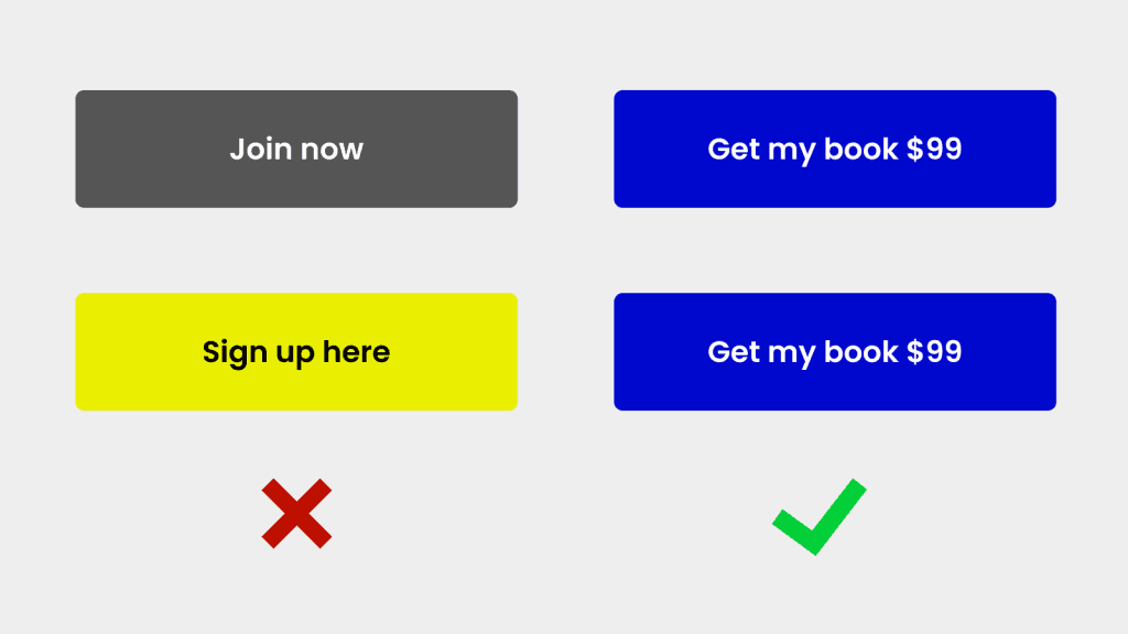
I do see a few examples of people having different text on their buttons. This only confuses users and reduces conversions.
Be sure to be consistent with text on your buttons and the colours of your landing page call to action buttons for the win.
10. Use action words!

This may seem like a no brainer. But be sure to use action words in your call to action. For example. Reserve. Claim. Get. Notify. All action words that will get your users to take action!
11. Use the word FREE

The word FREE is one of the most powerful words in the English language. Free will make people take action. If you your product permits a free demo, copy, download or free anything... try experimenting with the word Free in your landing page call to actions to get your conversion rates up!
That's a wrap!
Make these changes to your landing page call to actions and you will definitely see an uplift in conversions.
Spend the time making your buttons large, high contrast and craft that copy.
Don't forget to reduce the number of options on your page.
If you wan't a deep dive into landing page optimisation, be sure to grab your FREE chapter on my book Crazy Conversions here.


